Color Psychology Checklist for Launch Events

Chief Executive Officer
Colors influence emotions, decisions, and how people perceive your brand during launch events. Using the right colors can:
- Set the tone for your event and align with your goals.
- Boost audience engagement and reinforce your brand identity.
- Create emotional connections that make your product memorable.
Key Points to Consider:
- Understand Color Associations: Each color triggers specific emotions. For example:
- Red: Energy and urgency.
- Blue: Trust and professionalism.
- Green: Growth and balance.
- Purple: Luxury and creativity.
- Match Colors to Goals: Choose colors that align with your event's purpose, such as warm tones for energetic launches or cool tones for trust-building.
- Consistency is Essential: Apply your color scheme across all elements - stage design, lighting, signage, and promotional materials.
- Test and Refine: Test colors in your venue’s lighting and gather feedback to improve their impact.
By leveraging color psychology thoughtfully, you can create an engaging, memorable experience that supports your product's success.
How Color Psychology In Marketing Can MAKE OR BREAK Your Business
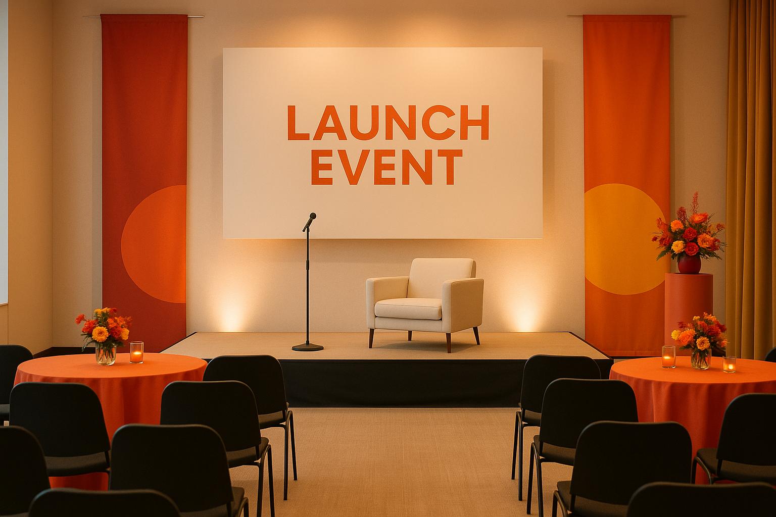
Define Event Goals and Match Colors with Brand Messaging
When planning an event, it’s vital to define clear goals and align your color choices with your brand identity. This approach ensures every visual element resonates with your audience and supports your event's purpose. Here's how to connect your objectives, brand personality, and color decisions to create the right emotional impact.
Set Clear Event Objectives
Every event has a purpose, and each purpose calls for a specific emotional tone. Colors play a huge role in setting that tone. By identifying your goals early, you can avoid color choices that conflict with your message.
- High-energy events thrive on warm tones like red, orange, and bright yellow. These colors spark action, urgency, and enthusiasm.
- Trust-building launches benefit from cool shades such as blue and deep green. These tones communicate reliability and professionalism, helping your audience feel secure about your product or service.
- Innovation-focused events often lean on colors like purple and vibrant green. Purple suggests creativity and premium quality, while green evokes growth and fresh ideas. Tech companies frequently pair these with clean whites and grays for a sleek, modern vibe.
Timing and context also matter. Morning events might call for energizing colors to wake up your audience, while evening gatherings can use warmer, cozier tones to create a relaxed networking atmosphere. Think of your color palette as an extension of your event’s story - it should amplify the mood you want to convey.
Include Brand Identity
Your brand colors are the backbone of your event’s visual design, but they don’t have to stand alone. You can expand on your brand palette to support the event’s goals while staying true to your overall identity.
Start by identifying your core brand colors and the emotions they already evoke. For example, if blue is a primary color, it likely signals trust and professionalism to your audience. Use complementary shades to build on these associations or introduce fresh layers to your brand’s story.
A handy approach is the 60-30-10 rule:
- 60% of your palette should feature your primary brand color.
- 30% can be complementary tones that enhance your message.
- 10% should be reserved for accent colors to add energy or focus.
Don’t overlook accessibility when designing your palette. Make sure text contrasts well with backgrounds, and consider how color choices might affect attendees with color vision differences. Thoughtful design not only improves usability but also reflects a brand that values inclusivity.
Choose Target Emotional Responses
With your goals and brand identity in place, it’s time to choose colors that evoke the emotions you want your audience to feel. This involves understanding how individual colors influence psychology and how they work together to create a cohesive experience.
- For excitement and energy, warm, bold colors like red, orange, and bright yellow grab attention and stir enthusiasm. Red, in particular, creates urgency, but it should be balanced to avoid overwhelming your audience. Orange adds friendliness, while yellow brings optimism and creativity.
- If you’re aiming for calm confidence and trust, cooler tones like deep blue and green set the right mood. Blue conveys competence and stability, while green suggests growth and dependability.
- To convey luxury and exclusivity, turn to rich, sophisticated colors. Deep purples, burgundies, and metallic accents like gold or silver exude elegance. Black, when used sparingly, adds a touch of sophistication but should be paired with lighter tones to avoid feeling too heavy.
Keep in mind the cultural context of your audience. Colors carry different meanings across cultures, so research how your chosen palette might be interpreted by international attendees. For example, while red often signifies excitement in the U.S., it may have other connotations elsewhere.
Finally, consider the intensity and saturation of your colors. Bright, saturated hues create bold emotional reactions, while muted tones or pastels offer a softer, more subdued effect. Adjust the intensity to match the emotional tone you want for your event. Whether you’re aiming for high energy or quiet sophistication, the right palette can make all the difference.
Choose and Apply the Right Color Palettes
With your color strategy in place, it’s time to focus on selecting palettes that align with your event’s goals and evoke the right emotions. This section takes the theory of color psychology and turns it into actionable steps for creating impactful color schemes.
Psychological Effects of Common Colors
Colors have a unique way of influencing emotions and even physical responses. By understanding how different colors affect people, you can make smarter choices that align with your event’s objectives.
Red is all about energy and urgency. It grabs attention and increases heart rates, making it perfect for accent elements like key signage, backdrops behind speakers, or interactive areas where you want to draw immediate focus. But too much red can feel overwhelming or stressful, so use it sparingly - avoid covering large spaces with it.
Blue conveys trust and professionalism. Darker shades like navy exude authority, making them ideal for corporate launches or B2B settings. On the other hand, lighter blues create a more relaxed and approachable vibe. Use blue for areas like registration desks, stage backdrops, or anywhere you want attendees to feel confident and at ease.
Green symbolizes growth and balance, making it a great fit for events tied to sustainability, health, or financial prosperity. It has a calming effect similar to blue but with a touch more vitality. Consider green for networking spaces, product demos, or anywhere you want to suggest innovation or forward-thinking.
Yellow sparks creativity and optimism but requires a delicate touch. Soft yellows can make spaces feel warm and inviting, while brighter shades are great for drawing attention to signage or wayfinding. Be cautious, though - too much yellow can cause eye strain or unease, so stick to accents rather than full-scale use.
Purple embodies luxury and creativity. Deep purples like plum or eggplant are perfect for premium product launches, while lighter lavenders soften the atmosphere. Pair purple with metallics for a high-end look, but balance it carefully to avoid overwhelming the space.
Orange combines the energy of red with the cheerfulness of yellow, making it ideal for sparking enthusiasm and conversation. It’s particularly effective for tech events, creative industries, or interactive zones. Use orange in food and beverage areas or spaces designed for networking.
Build Balanced Color Combinations
A well-thought-out color palette isn’t just about picking individual colors - it’s about how they work together and how they’re distributed across your event space.
- Complementary colors (like blue and orange) create bold contrasts but should be used sparingly to avoid visual tension.
- Analogous schemes, which use colors next to each other on the wheel, create a more cohesive and polished look.
- Triadic combinations offer variety while maintaining harmony - choose one dominant color and use the other two as accents.
When designing your palette, think about the weight of colors. Darker shades feel more serious, while lighter ones add an airy, welcoming vibe. For instance, pairing deep navy with crisp white and a soft accent like coral or gold creates a balanced look. Similarly, mixing shades within the same color family - like forest green, sage, and cream - adds depth without clashing.
Avoid Common Color Mistakes
Knowing what not to do is just as important as knowing what works. Here are some common pitfalls to steer clear of:
- Overstimulation: Too many bright, saturated colors can overwhelm attendees. Reserve bold colors for focal points like stages or product displays.
- Cultural missteps: Colors carry different meanings across cultures. Research their associations if your event has an international audience to avoid unintended messages.
- Accessibility issues: Don’t rely solely on color to convey information. Include text, patterns, or shapes to ensure your event is inclusive for attendees with color vision differences. Also, check for strong contrast between text and backgrounds.
- Lighting challenges: Event lighting can dramatically alter how colors appear. Test your palette under the actual lighting conditions to avoid surprises.
- Brand inconsistency: Straying too far from your established brand colors can dilute your identity. Use complementary colors to enhance your core palette rather than replacing it.
- Seasonal mismatches: Colors that clash with the season can make your event feel out of sync. Choose shades that reflect the time of year.
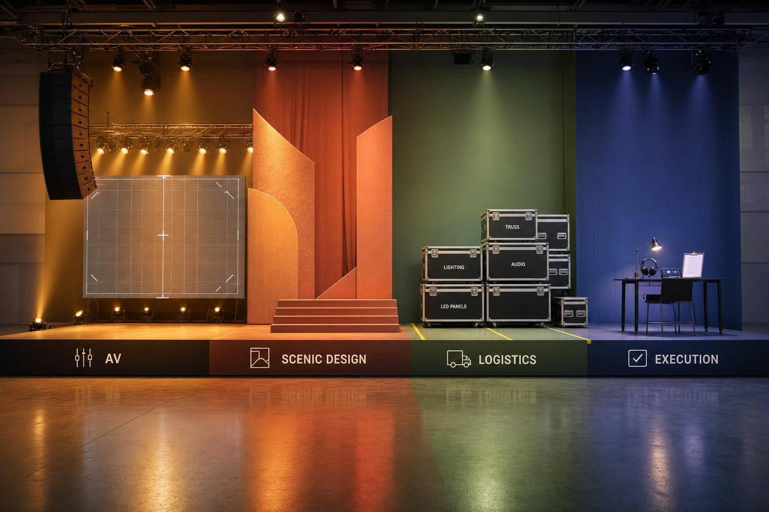
Apply Colors Across Event Elements
Once you've established your event's color palette, weave those colors through every aspect of the event. This creates a unified experience that strengthens your brand's presence and leaves a lasting impression.
Stage and Scenic Design
The stage is your event's focal point, making it the perfect canvas to showcase your brand's colors. Use your primary color in the backdrop to set the tone and align with your brand's identity. For instance, if you're launching a tech product and want to convey trust and innovation, a deep blue backdrop with subtle geometric designs can strike the right balance between authority and visual intrigue.
Incorporate secondary colors into scenic details like podiums, display panels, and decorative structures to add layers of interest without overwhelming the main focus - your speakers or product demonstrations. Keep product displays clean and professional by using neutral backdrops with intentional pops of your brand colors. Choose fabric finishes, such as matte or glossy, that enhance the overall look under stage lighting, ensuring everything appears polished and professional.
Lighting and Audiovisual Content
Lighting plays a crucial role in bringing your color strategy to life. Modern LED systems allow for precise control, making it easier to align lighting with your brand's palette. Ambient lighting should complement your primary colors while ensuring the stage is well-lit for both in-person attendees and cameras. For example, warm white lights with subtle color accents can set the mood without compromising visibility or video quality.
Dynamic lighting effects, like transitions from calming blues to energizing oranges, can guide audience emotions throughout the event. Ensure all audiovisual content - like slide decks, video backgrounds, and motion graphics - matches your color scheme. This consistency extends to any digital signage displayed across the venue.
If your event involves live streaming, test how your chosen colors appear on camera and across viewing devices. Colors can shift when viewed through a screen, so adjustments may be necessary to maintain the intended look and feel.
Signage, Wayfinding, and Interactive Zones
Your primary colors should dominate key areas like registration and navigation signage, immediately establishing your brand's presence. Accent colors can be reserved for special zones, such as VIP areas or interactive spaces, to create a natural visual hierarchy that guides attendees effortlessly.
Interactive zones and demo stations offer opportunities to use color to influence behavior. For example, warmer hues like orange or coral can encourage hands-on participation and lively conversations, while cooler tones like blue or green can create a calming atmosphere in networking spaces, fostering deeper connections.
Food and beverage areas are another chance to use color strategically. Warm tones - soft reds, oranges, or golden yellows - can make these spaces inviting and encourage mingling. However, balance is essential to avoid overstimulating the environment, which could make it feel chaotic instead of welcoming.
Lastly, branded materials and giveaways should also reflect your color scheme. From name badges and lanyards to promotional items and welcome kits, every detail should tie back to your event's color strategy. This not only enhances the event experience but also ensures your brand stays top of mind as attendees take these items home or back to their offices.
sbb-itb-ae35a94
Test and Improve Color Strategies
Testing your color choices ahead of time can save you from costly missteps and ensure you achieve the impact you’re aiming for. Combining pre-event testing with real-time feedback during the event lets you refine your color strategy for the best possible outcome.
Test Color Schemes
Begin testing your color schemes during the venue walkthrough and setup. Colors can look drastically different depending on the lighting conditions. By testing your setup under the venue’s actual lighting, you can confirm whether your chosen colors will deliver the desired effect. This early testing phase is crucial for laying the groundwork for feedback collection once the event is underway.
Collect Feedback and Analytics
Once the event begins, take advantage of behavioral scales to gather real-time insights into how attendees perceive your color choices. Tools like valence, intensity, and arousal scales can help you measure emotional tone, the atmosphere's feel, and energy levels associated with your color decisions. Post-event surveys are another valuable tool - ask attendees specific questions about their visual experience to assess how well your color strategy resonated.
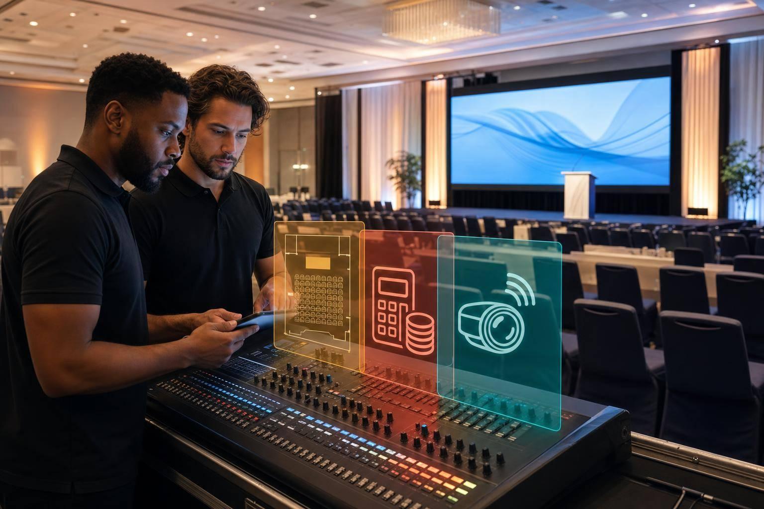
Corporate Optics: Expert Technical Support for Color Integration

To flawlessly implement your carefully tested color strategies, having specialized technical support is a must. Bringing color psychology into technical event elements requires a deep understanding of how to turn theory into striking visuals that leave a lasting impression.
Technical Expertise in Event Color Design
Corporate Optics provides comprehensive event production services, including scenic design, lighting coordination, and audiovisual production. Their goal? To ensure every technical aspect aligns with your event's objectives. During the Design phase, they collaborate closely with clients, walking them through the technical requirements needed to transform their vision into reality. This approach ensures that every production element supports seamless color integration, making it a core part of the event’s design.
Tailored Solutions for Flawless Execution
Expanding on the strategies discussed earlier, Corporate Optics uses advanced technical tools to bring your color vision to life. They coordinate scenic design, lighting, audio, and visual elements to ensure your color strategy is consistently represented throughout the event. By weaving color psychology into every technical detail, they elevate an event from simply good to truly unforgettable.
When planning a launch or major event, teaming up with experts who understand both the science behind accurate color reproduction and its emotional impact on audiences can make all the difference.
Conclusion: The Power of Color in Launch Events
Color psychology plays a crucial role in transforming launch events into memorable experiences that leave a lasting impact on your audience. With 85% of customers stating that color influences their purchasing decisions and up to 90% of snap judgments about products being based on color, the hues you choose at your event can shape how attendees perceive your brand and whether your message sticks with them.
At the heart of a successful launch lies an emotional connection. The best events go beyond aesthetics - they create a bond between your brand and the audience. It's not just about decorating a venue; it's about crafting an experience that stirs emotions and inspires action.
Key Takeaways
Integrating thoughtful color choices throughout your event can take it to the next level. Effective use of color psychology requires a well-planned, intentional approach. Start by identifying your event's goals and aligning them with your brand's identity. For instance, a company emphasizing sustainability might lean on greens and earthy tones, while a luxury brand could opt for purples and golds to convey exclusivity.
Consistency is key. When applied across stage design, lighting, signage, and digital content, a cohesive color palette can boost brand recognition by 80% and increase revenue by 23%.
Keep cultural context in mind, especially in a diverse market like the U.S. Colors carry different meanings - red, white, and blue evoke patriotism, while green often symbolizes eco-consciousness or financial prosperity. Understanding these associations helps avoid missteps and strengthens your connection with attendees.
Testing and refining your approach can elevate your event from good to exceptional. Use surveys to gather feedback, analyze engagement metrics, and evaluate how different color-themed zones perform during the event. This data will be invaluable for fine-tuning future launches and enhancing the impact of your color strategy.
Finally, partner with experts to ensure a seamless execution. The leap from color theory to a flawless visual experience is significant, and working with skilled professionals ensures your vision comes to life in a way that captivates your audience.
Color psychology isn’t just about aesthetics - it’s a powerful tool for creating an environment where your brand message resonates on both a conscious and subconscious level. When executed well, it turns your launch event into an unforgettable experience that delivers tangible results for your business.
FAQs
How can I choose colors for a launch event that appeal to a global audience?
To design a color palette that connects with people worldwide, it's essential to first explore how colors are perceived across various regions. For instance, red is seen as a symbol of luck in some parts of the world, while in others, it might represent caution. Grasping these differences helps ensure your color choices feel inclusive and resonate with everyone.
Beyond cultural considerations, think about how colors can trigger universal emotions like excitement, trust, or calmness. By aligning these emotional cues with the objectives of your event, you can create visuals that not only draw attention but also leave a memorable impression on attendees from all walks of life.
How can I test and fine-tune color schemes to make a stronger impact at my event?
To make sure your event's color scheme leaves the right impression, start by playing around with color palettes using tools like design software or color wheel apps. These tools let you see how different combinations come together visually. Use basic color theory principles, such as pairing complementary or analogous colors, to create the right mood or evoke specific emotions.
Get input by sharing mockups or visuals with your team or a small focus group to see how they respond. Then, take it a step further by testing the colors in real-world conditions, like under the event's actual lighting. This helps you confirm that the colors look as planned and contribute to the overall vibe. Based on these tests, tweak the palette to ensure it delivers the best possible impact.
How can I use my brand's colors to create a visually engaging and memorable product launch event?
To weave your brand's colors seamlessly into a product launch event, pay special attention to lighting, decor, and visual elements that represent your brand's identity. Use dynamic lighting to showcase your brand colors during key moments, such as guest arrivals, transitions, or the big product reveal. Extend these colors into banners, signage, table arrangements, and other decorative elements to maintain a unified and polished look.
Consider the impact of color psychology when setting the mood. Warm tones like red and orange can spark energy and excitement, while cooler hues such as blue and green inspire a sense of calm and trust. By carefully blending these details, you can craft an immersive experience that leaves a lasting impression and echoes your brand's message.
Related Blog Posts


Streamline your workflow, achieve more

Lorem ipsum dolor sit amet, consectetur adipiscing elit. Maecenas ac velit pellentesque, feugiat justo sed, aliquet felis.

Lorem ipsum dolor sit amet, consectetur adipiscing elit. Maecenas ac velit pellentesque, feugiat justo sed, aliquet felis.