How to Design Lower Thirds for Branding

Chief Executive Officer
Lower thirds are the small graphics at the bottom of a video that display names, titles, or other information. They might seem minor, but they’re crucial for creating professional, branded video content. Here’s why they matter and how to design them:
Why Lower Thirds Are Important
- They reinforce your brand by using consistent colors, fonts, and logos.
- They make videos look polished and professional, improving viewer trust.
- They help communicate key details clearly, like speaker names or event info.
Key Design Elements
- Colors: Use your brand’s palette with high contrast for readability.
- Fonts: Stick to clean, legible sans-serif fonts like Arial or Helvetica.
- Logos: Position logos subtly to support, not overshadow, the text.
Tips for Creating Lower Thirds
- Use templates in tools like Adobe Premiere Pro or After Effects for consistency.
- Export designs as transparent PNGs for seamless integration in videos.
- Test readability on different screens and backgrounds before finalizing.
How to Design Lower Thirds in Adobe Express | Creative Live Branding
Key Components of Effective Lower Thirds
Every element in a lower third - color, typography, and logo placement - plays a crucial role in showcasing your brand and maintaining a polished look. When these components work together, your video content achieves both clarity and consistency.
Color Selection and Brand Alignment
Color is the backbone of any impactful lower third design. The colors you choose should align seamlessly with your brand's identity, pulling from your logo, website, and other marketing materials. This creates a unified visual experience and reinforces brand recognition.
Think about the emotions you want to evoke: warm tones convey energy, cool tones build trust, and neutral tones suggest sophistication. For legibility, ensure a contrast ratio of at least 4.5:1 between text and background. This not only enhances readability but also ensures your content is accessible across various devices and lighting conditions.
Stick to a palette of 4–6 colors. Use primary colors for backgrounds, secondary colors for accents, neutrals for text, and one or two highlights to add emphasis. This keeps your design clean and avoids a cluttered appearance. Test your colors against different video backgrounds - what looks good on a white screen may not work against a busy or light-colored backdrop. For text-heavy areas, consider muted or low-saturation backgrounds to maintain readability, even when there's motion or complex visuals behind the lower third.
Once your colors are set, the next step is choosing the right typography.
Font Choice and Text Clarity
Typography is not just about style - it’s about making your message clear and easy to read. Your font choice should reflect your brand's personality while staying legible, especially on smaller screens.
Sans-serif fonts like Arial or Helvetica are excellent options for their clean and bold appearance. Avoid script or overly decorative fonts, as they can compromise readability.
Think about your audience and the devices they’ll use to view your content. Ensure the text size is large enough for even the smallest screens. Establish a clear font hierarchy: use larger, bolder fonts for primary information and smaller, lighter fonts for secondary details. This hierarchy helps guide the viewer’s attention and ensures your message is delivered effectively.
Logo Positioning and Design Integration
Your logo is a key branding element, but it should complement - not overshadow - the main message.
Position the logo on the left or right side of the lower third to support the text layout. Centering the logo is only advisable if symmetry is part of your design’s intent. Scale your logo appropriately; a logo that’s too large can dominate the design, while one that’s too small may lose its impact, especially on smaller screens.
For complex logos with intricate details, consider creating a simplified version. Logos with fine lines or small text often don’t translate well at reduced sizes. A simplified wordmark or logo icon can work better in these scenarios.
Lastly, make sure your logo colors harmonize with your chosen palette. If your brand colors don’t stand out against the background, consider using a single-color version of your logo or adding a subtle shape behind it to improve visibility. The goal is to integrate the logo subtly - it should enhance brand recognition without pulling focus away from the text or speaker identification, which are the primary purposes of lower thirds.
Now that you understand the key components, you're ready to apply these principles to create lower thirds that are both professional and visually cohesive.
Step-by-Step Guide: Creating Branded Lower Thirds
Making professional lower thirds that align with your brand involves a clear process. You’ll need to choose the right software, decide whether to use templates or start from scratch, and ensure your export settings are spot-on.
Working with Templates in Video Editing Software
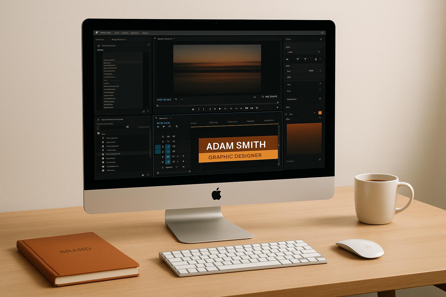
Adobe Premiere Pro makes creating lower thirds straightforward with its Essential Graphics panel. Start a new project, then use the Type tool to create a title. This method gives you control over the typography, placement, and animation timing. For more advanced animations, Adobe After Effects is your go-to.
If you’re designing static graphics, Photoshop is a great option. Design your lower third on a transparent background and export it as a PNG file. This allows you to import the design into your video editing software with precision.
Your choice of software should match the complexity of your project and your skill level. Premiere Pro is ideal for simple text-based lower thirds, while After Effects is better suited for intricate animations or integrating detailed brand elements.
Once you’ve chosen your software, it’s time to incorporate your brand’s visual identity into the design.
Applying Brand Colors, Fonts, and Graphics
Organizing your brand assets before diving into design work can save time and ensure everything stays consistent. Most video editing software allows you to create a Brand Kit - a central hub for your logos, colors, and fonts. This setup helps maintain uniformity across all your videos.
When applying brand colors, think strategically. Use your primary colors for accents and keep the background neutral to keep the focus on the subject. High contrast between text and background is essential, especially for live streams where the video composition might change unexpectedly.
Typography also plays a major role in readability. Stick to one headline font and one body font from your Brand Kit, and use consistent sizing for titles, captions, and callouts. Sans-serif fonts are often a better choice since they’re easier to read across different screen sizes, from desktops to smartphones.
Logo placement requires careful thought. Ensure there’s enough space between the logo and the edges of the frame to avoid crowding. Place it in a corner where it’s visible but doesn’t compete with the text. For intricate logos, consider creating simplified versions that still represent your brand but work better at smaller sizes.
If your brand colors don’t contrast well with certain video backgrounds, you can use single-color logo versions or add subtle background shapes to improve visibility. The goal is to integrate your branding seamlessly without distracting the viewer.
Saving and Testing Your Lower Thirds
Once your design is complete, the next step is exporting and testing your lower thirds. Proper export settings make a big difference. Always export as PNG files with transparency (alpha channel enabled) so that the graphics overlay smoothly on any video background. Match the resolution of your exports - 1080p or 4K - to your main video specs to avoid scaling or pixelation issues.
Testing your lower thirds is just as important as designing them. Try them out on both light and dark video backgrounds and view them on different devices. A design that looks great on a computer screen might not translate well to a smartphone or tablet.
Keep your audience’s viewing habits in mind during testing. With 79% of US consumers preferring to watch videos on their smartphones, making sure your graphics are mobile-friendly is critical.
For future projects, organize your files systematically. Create a library of templates labeled for different purposes - like speaker introductions, social media handles, or event details. This not only saves time but also ensures consistent branding across your videos.
Lastly, prepare multiple versions of each lower third to suit various needs. For instance, you might need different text lengths, alternate color schemes for varying backgrounds, or simplified designs for smaller screens.
Strong branding elements, like well-designed lower thirds, can boost engagement and improve how well your audience remembers your brand. Taking the time to perfect these details is a smart investment in your video strategy.
sbb-itb-ae35a94
Best Practices for Brand Consistency and Professional Results
When designing lower thirds, keeping your brand identity consistent while meeting production standards is key. This involves focusing on readability, maintaining a cohesive look, and ensuring a polished, professional presentation. By nailing these aspects, your graphics will not only enhance your video content but also strengthen your brand's presence.
Following Brand Guidelines
Stick to your brand guidelines by emphasizing clarity and simplicity. Opt for clean, easy-to-read fonts and establish a clear typography hierarchy so viewers can quickly grasp the information. High contrast between text and the video background is essential - if your brand's primary colors don’t provide enough contrast, consider using alternative shades or adding subtle shadows or semi-transparent overlays to improve visibility.
For transitions, choose smooth and understated effects, like fades or slides, that align with your brand's overall style without pulling focus from the main content. Once your design elements are finalized, test them to ensure they perform well in real-world scenarios.
Testing in Different Situations
Testing is crucial to ensure your lower thirds work seamlessly across all production environments. Live streaming, for example, presents unique challenges such as compression issues, varied lighting, and unpredictable backgrounds, all of which can affect the readability of your graphics.
Check how your lower thirds appear on different screen sizes to confirm they’re legible for all viewers. Timing also matters - standard information should remain on screen for about 5 to 10 seconds, giving viewers enough time to absorb the message without disrupting the flow of live events.
Additionally, test your designs against various video backgrounds. Whether it’s a dimly lit conference room, a bright outdoor setting, or a busy presentation slide, your lower thirds should remain clear and visually appealing.
Common Problems and How to Fix Them
Designers often face challenges when trying to make lower third text readable over dynamic or busy backgrounds. To address these issues, you can apply practical techniques that build on the earlier principles of brand-aligned colors and clear typography.
Making Text Readable on Any Background
One of the toughest parts of designing lower thirds is ensuring your text remains sharp and easy to read, even when the background is constantly changing - like during live events where you can't control what's behind the graphics.
Add subtle backdrops or shadows to separate the text from the background. For instance, when using white text over bright footage, apply a drop shadow with 0 distance, 200 softness, and 20–50% opacity. This small adjustment can make a big difference in text clarity. You can also use overlays or shapes to further define text areas.
Use overlays and shapes to create readable zones. A popular method is to add a dark overlay to the background footage and adjust its opacity. Pair this with white text to create contrast while keeping the background visible. Alternatively, try adding white-shaped overlays with slight opacity adjustments behind black text. This allows the background to peek through while still ensuring the text stands out. If your brand colors don’t provide enough contrast, consider using alternative shades or additional design elements to improve visibility.
Adjust the brightness of your background footage when needed. For example, apply the 'Curves' effect to lower the white point and darken overly bright areas, helping white text stand out without being too harsh. If specific bright spots are an issue, mask those areas on an adjustment layer and use the 'Curves' effect to reduce their intensity.
Position text strategically within safe areas. While lower thirds are usually placed at the bottom of the screen, you can move them to other areas if it improves readability. Just make sure the text stays within the "Title Safe area" to ensure it’s visible on all screen sizes and display types.
Conclusion: Main Points for Designing Branded Lower Thirds
Crafting effective lower thirds is all about striking the right balance between eye-catching design and clear communication. By sticking to your brand's core elements - like your color palette, typography, and logo placement - you can create visuals that not only look professional but also leave a lasting impression.
But design is just half the battle. Getting the technical side right is equally important. Reusable templates are a game-changer, saving you time while keeping your style consistent across projects. And don’t skip testing! Checking how your lower thirds look in different viewing conditions can help you spot and fix readability issues before they cause problems in live events or final productions.
One of the trickiest parts? Ensuring text stays readable no matter the background. Simple tweaks, like adding soft shadows, using semi-transparent overlays, or positioning text within safe zones, can make a huge difference. These small adjustments can boost readability without sacrificing your brand’s polished look.
At the end of the day, lower thirds have one main job: delivering information clearly while reinforcing your brand's identity. When done well, they elevate the professionalism of your content and strengthen your brand’s presence.
At Corporate Optics, we bring these principles to life. Whether it’s a live stream or a video presentation, we ensure your branded graphics blend seamlessly with your content, creating a polished and consistent experience that amplifies your brand at every level.
FAQs
How can I make sure my lower thirds are easy to read on any video background or device?
To keep your lower thirds easy to read on different video backgrounds and devices, prioritize contrast and simplicity. Choose high-contrast color pairings, such as white text on dark backgrounds or dark text on light ones. Adding subtle shadows or semi-transparent overlays can help the text stand out against busy visuals.
Place your lower thirds in the bottom third of the screen, steering clear of areas with essential visuals. Stick to a clean, consistent design by using minimal fonts and avoiding over-the-top animations. This ensures that your branding elements, like logos and text, look polished and maintain their visual appeal.
What should I avoid when creating lower thirds for branding?
When creating lower thirds for branding, steer clear of difficult-to-read fonts, poor color contrast, and designs that appear overcrowded or unpolished. These missteps can undermine the effectiveness of your lower thirds and pull attention away from your message.
To make sure your design reflects your brand identity, focus on keeping it clean and consistent. Choose contrasting colors for better readability, limit the on-screen duration of the graphic, and thoughtfully integrate your brand's colors, fonts, and logo. A well-organized design not only looks professional but also leaves a memorable impression on your audience.
What should I consider when choosing video editing software for creating branded lower thirds?
When choosing video editing software for creating branded lower thirds, it's important to focus on tools that are user-friendly, highly customizable, and compatible with your workflow. Key features to look for include color management, font options, and the ability to integrate your logo seamlessly. These elements ensure your lower thirds reflect your brand's identity effectively.
Opting for software that provides pre-designed templates and smooth animation features can save you time while still delivering a polished, professional appearance. Whether you're a beginner or a seasoned editor, pick a program that aligns with your skill level and branding requirements. The right software will help you create visually cohesive and striking lower thirds that elevate your video content.
Related Blog Posts


Streamline your workflow, achieve more

Lorem ipsum dolor sit amet, consectetur adipiscing elit. Maecenas ac velit pellentesque, feugiat justo sed, aliquet felis.

Lorem ipsum dolor sit amet, consectetur adipiscing elit. Maecenas ac velit pellentesque, feugiat justo sed, aliquet felis.